Crafting Typography
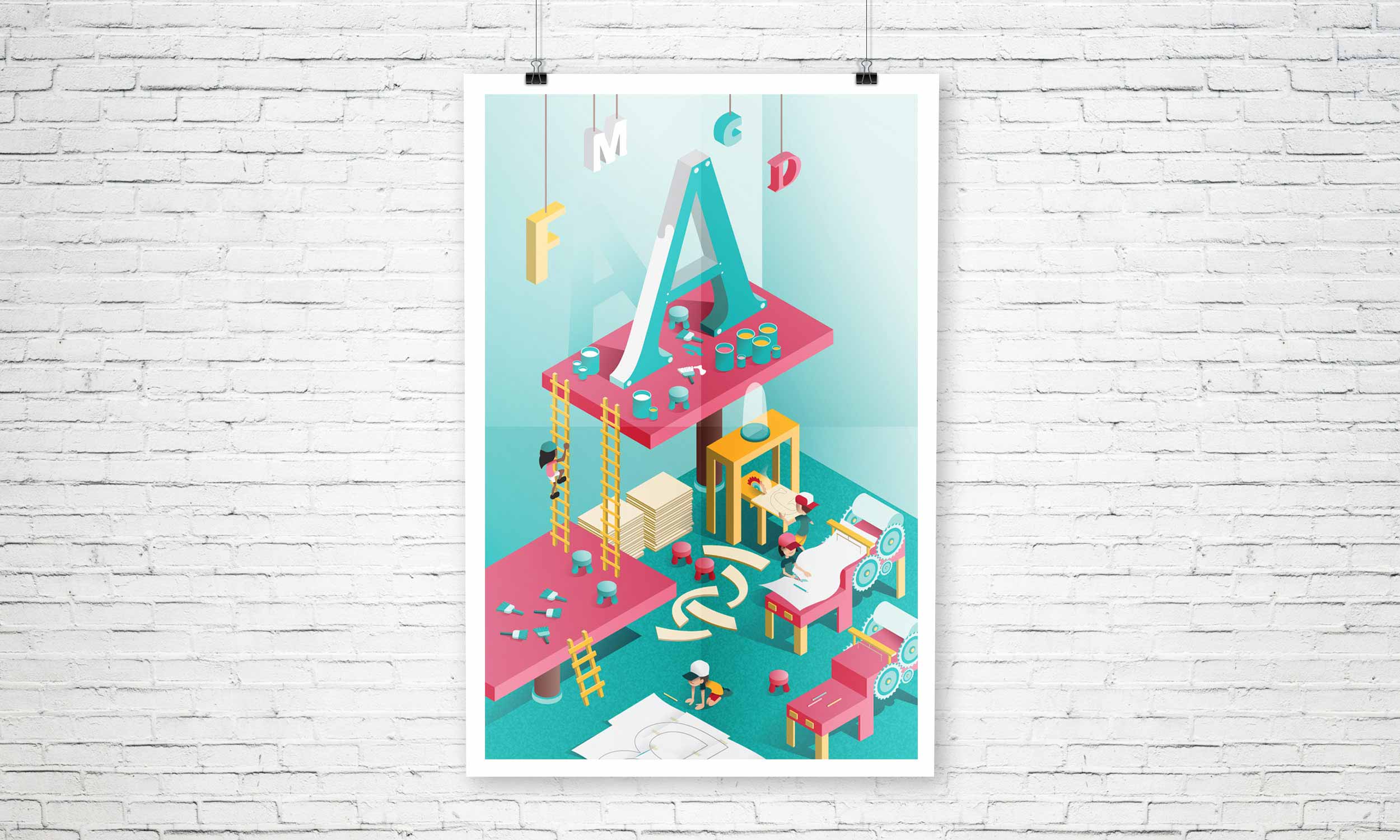
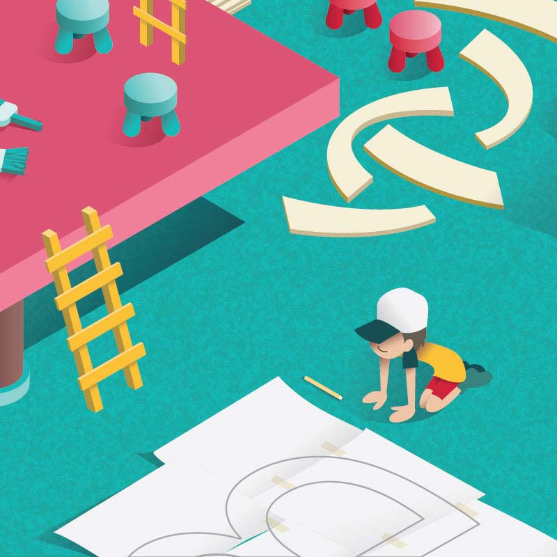
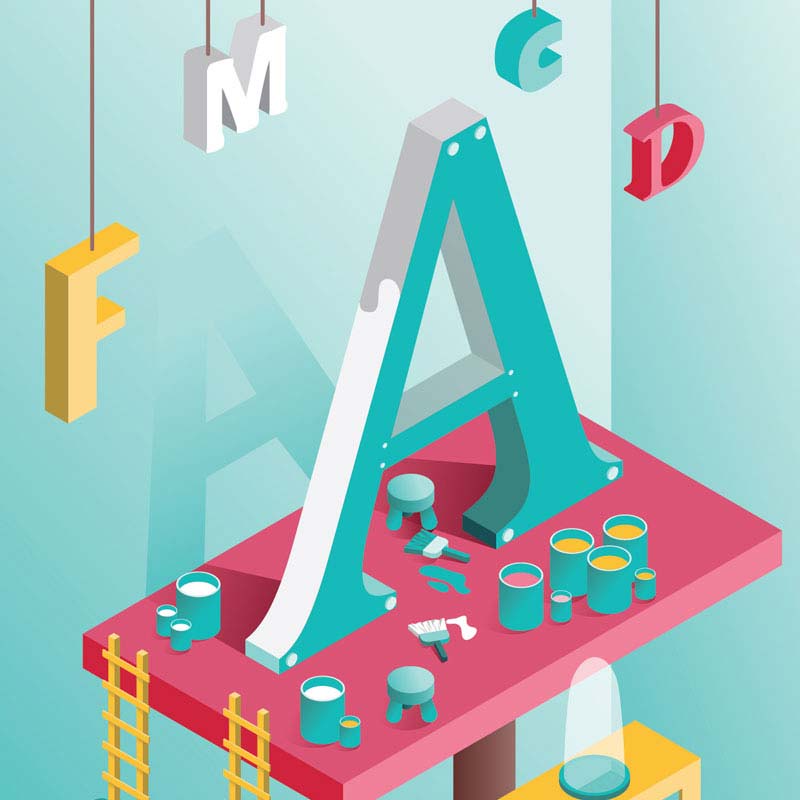
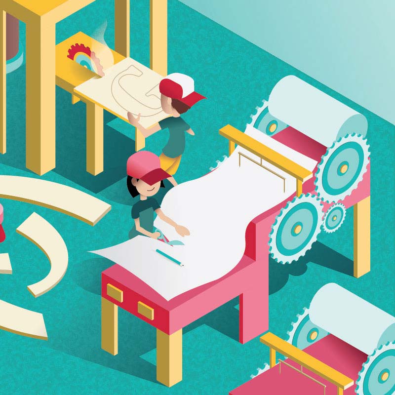
In this illustration, my design concept was to demonstrate an isometric illustration of the crafting typography process in Adobe Illustrator.
The biggest challenge I faced during the process was trying to keep everything tidy and neat as much as possible within the large number of layers this illustration demanded. I spent a lot of time making sure the shapes were united where they needed to be. When it was viewed in outline mode, the shapes of the objects were clear without other objects interfering on top.
My colours were merely based on fun and inviting warm and cool hues. It gave the illustration an engaging look and feel.


